Interview: Senhorita Spencer from Pixel Delicioso
Senhorita Spencer, thanks so much for participating in this interview. Can you begin by telling us about your background? What do you do for a living?
Movie App Amora by David Lanham
Amora. David Lanham
My main job is at a university, I'm responsible for a small TV studio and video editing facility where the students do their projects in a degree in Media Studies. That's half the time.
The other half I'm a video editor. I do a lot of work for the school but I also do documentaries and short films. I have also recently started teaching at the university. So now I'm a college professor too!
How you come up with the idea for Pixel Delicioso?
iPhoto icon X-pack by Nato Kino
X-pack. Nato Kino
A friend of mine saw my desktop and was curious where I had gotten the cool icons and wallpaper I was using. I told him to check out MacThemes, DeviantArt and The Iconfactory. A couple days later I was talking to him on the phone and he said there was just too much to go through, he wouldn't know where to start. So I offered to make a selection for him. When I was doing this I got the idea of making the selection available to other friends and decided a blog would be a simple enough way to do it.
Could you tell us about your interest in desktop art? What sparked your interest?
Preview Icon from Black System by Vegrafik
Black System. Vegrafik
I have always loved icons and walls. Ever since the days of Windows 3. Last year I got a 24 iMac to replace my old and faithful eMac of almost 5 years and that's when it really took off. I was searching for updated versions of my favourite walls and icons and I started to grow a respectable collection.
It got serious when I found myself eagerly awaiting the release of Vegrafik's Black System Icons at MacThemes. It was a historic thread as some people would agree and it made me realize I was hooked beyond my control.
But I wasn't into doing screenshots or anything like that. I just wanted to find the perfect icon for a certain application or folder. I even changed the icons of single files. And I liked to change my wallpaper on a regular basis. But I missed my Good Grey Tiger theme... I hated that you couldn't theme Leopard, not even partially, at the time. I hate default anything!
Is your desktop always neat and newly styled or does it vary? How do you like to customize your own desktop?
"I love neatness. I'm a total neat freak. In my desktop and in my real world desk. Everything has its place and everything must be aligned."
Desk with iMac
I love neatness. I’m a total neat freak. In my desktop and in my real world desk. Everything has its place and everything must be aligned. My desktops have since evolved into more unified concepts but I don't change them that often. I like to live with one for a while and if I really like it — as is the case with the current one which has lasted for nearly a month! - I find it hard to let go. But one day I just look at it and think: it's time! I usually start with the wall and then go find the icons to go with it. But sometimes the icons are the ones that make me want to change.
Bump It by Senhorita Spencer
Bump It by Senhorita Spencer
My desktops are sometimes very feminine and sometimes quite neutral but always soft and flowy. I love minimal and hightechy stuff but I also love over the top busy designs and I'm in love with all things vintage. Right now I'm in a bit of a monochromatic phase. I'm finding that colour is a little distracting. Probably because I've had a lot of work to do...
Do you have any favourite desktop artists?
I admire a lot of artists, the usual suspects when it comes to icons: David Lanham, Vegrafik, Louie Mantia, Laurent Baumann, Rick Patrick, Pinky Von Pout, Jonas Rask. For walls: Plexform, Mickka, Venom339, Kano89, Manicho, imrik, mattahan, Alexander-GG, xnhan00, all from DeviantArt. To name just a few. I discover new artists everyday.
What are some of the challenges you've had with the site?
Developer Icon from Pry Alu by Jonas Rask
Developer Icon. Jonas Rask
I have zero coding skills and less than zero design skills. The site design is from a template I found online and did some tweaks to. All through trial and error since I know next to nothing about html or any other coding language. So that was the challenge at first. Now it really is keeping up with the releases.
This project started out of a desire to share my sources with some friends and also have an online archive for myself, but it has been growing steadily and it has acquired a surprising number or followers. So now I feel I really have to be on top of things to keep the customers satisfied!
How do you go about selecting desktop art for Pixel Delicioso?
At first I just put up all my favourite stuff, everything I could remember and still find. Now it's become more of a "look what I just found!" thing, meaning that I go through a few sites almost everyday and select new releases that I think deserve attention. But if I find something I really love that isn't new I post it too. I had sort of a rule in the beginning that was "I'll only post stuff that I would use myself" but then I let it go because I realized there was stuff that maybe I wouldn't use but had quality or was a certain style that was interesting or original.
Caught In A Whisper by Senhorita Spencer
Caught In A Whisper by Senhorita Spencer
I have to like it, it has to somehow catch my eye. I tend to stay away from stuff that is too cute or girly or too cartoony. And there's not a lot of photography because I normally don't use photos on my desktop. And I don't post walls that have text, I don't like to impose or endorse statements.
Most of the art comes from DeviantArt, which I love but is so unfiltered, MacThemes and a few other sites like Customize.org or InterfaceLIFT and several personal designers' sites. Whenever I have time during the day, sometimes in the morning, sometimes when I'm eating my lunch or late, late, late at night I do my searches and post away. It is quite time consuming but I do take days off. Never on a thursday though, the day more good stuff is released and also the busiest day in terms of traffic, curiously.
What are your future plans for the site?
Redesign, redesign, redesign. The template has done its job but I feel it's time for a change, something a little more polished and sophisticated. Anyone interested?
What do you enjoy the most about running Pixel Delicioso?
MailPlane Icon by cj1224
MailPlane. cj1224
Feedback. Just a few days ago I got an e-mail from a guy saying that Pixel Delicioso had re-ignited his interest in GUI. How great is that?
I also like the idea that I'm giving back a little to all the great artists and designers who let us have their amazing work for free. And the fact that I have an excuse for spending so much time online searching for the latest customizing goodies!...
You've started a successful blog around one of your hobbies without any prior knowledge about blogging. What is your advice to other people who are in a similar situation and would like to start a blog about one of their interests?
Text Editor Icon Amora by David Lanham
Amora. David Lanham
I had a few friends who had blogs on Blogger, so that was the first place I went to and it's the one I use but there are others like WordPress or Webs. It's super easy and it's totally free. You just follow a couple of simple steps and you're ready to go.
You must have a Google Account or you can easily create one on the spot. You should give some thought to the name of your blog, especially what you put in the URL (the web address) because you won't be able to change it.
Then it's time to choose the look of your blog. At Blogger they offer a variety of nice design layouts (templates) you can choose from and then you can select your own colours. There are also lots of sites that offer alternative templates if you want something a little different from the ones that Blogger proposes. I found a nice one at Elegant Blogger Templates.
Photoshop Icon from Black System by Vegrafik
Black System by Vegrafik
My suggestion is to search, search, search. Use Google to find templates and information about the subject you want to blog about and also to learn a little bit about Html (the language that is used to code Blogger pages) and to understand a little about colour theory and its relation to web design. This is important to give your blog a more polished look and keep visitors interested. Because even if the content is great you probably wouldn't want to go back to a site that is unappealing or has a colour scheme that hurts your eyes.
I also suggest you get something like Site Meter (also free) so you can keep track of the traffic to your blog. Then you can start posting away. What you post is up to you and there are no rules. Even if you're just doing it for yourself it can be very rewarding. But if it gets noticed and people start to visit it regularly that's when it gets interesting.
Perhaps you could tell us a little bit about your interest in photography and interior design?
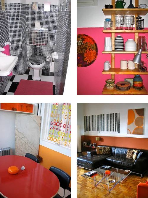
My home is very colorful and contrasting. I don't like plain white walls but white is always the base for the colour scheme. The ceilings, trimmings and a good part of the walls are white. Then I just add colour. Lots of it!
Senhorita-Spencer-Interior-Design
The desktop customizing is closely related to the interest and pleasure I get from interior design. I couldn’t live in a default looking home any more than I could live in a default looking operating system.
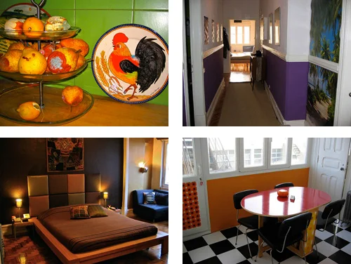
My home is very colorful and contrasting. I don't like plain white walls but white is always the base for the colour scheme. The ceilings, trimmings and a good part of the walls are white. Then I just add colour. Lots of it! And I like mixing lots of styles. I get stuff from IKEA and when I get home I assemble it, and customize it.
Senhorita-Spencer-Interior-Design-2
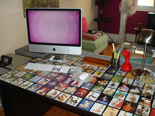
I do it to my appliances too and to vintage second-hand furniture bargains I find along the way. I use whatever I have laying around but mostly a pair of scissors and some sticky-back-plastic. I know it sounds a little corny but it's a really fun product. There are so many styles and designs and textures. It's a whole world! I just love my snakeskin speakers and my pin-up decorated desk! And yes, I cut out all those stripes and circles myself...
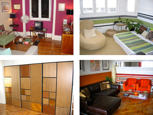
I'd like to do interior design a little more seriously and break it out of my home, but I don't think my style appeals to everyone and I don't know if I could get away from it too much... I'd like to try though.
Senhorita-Spencer-Interior-Design-3
For fun, me and a friend go to friends' houses and give them advice (if they ask for it of course) on how they can improve their decoration, make a better use of their space, use colour and stuff like that. Sometimes a little paint can really make a big difference.
I don't take photography seriously at all. The stuff I first submitted to senhoritaspencer on deviantART, was just for fun, a series called Urban Oddities (Insólitos Urbanos) that's basically curious and weird things and scenes I find on the street or wherever I go, from a perfectly intact orange peel on the side walk to a leopard paint job on a Mercedes. And food. I like to take pictures of dishes I make or order at restaurants, food displays at markets, very informal and unplanned stuff. Because I do love good food.
Finally, what are some of the things you enjoy in your everyday life?
Graphics Icon from Pry Alu by Jonas Rask
Pry Alu by Jonas Rask
The other day I had an unexpected day off from work so I went to the beach and had a little sushi picnic. It was wonderful. There's something about the beach during winter and combining it with one of my favourite foods ever was simply perfect.
And I like doing nothing. But plan it and really enjoy it. Then I might get bored and start redecorating something! That's when the creative juices flow the most for me, when I don't really have anything to do.
Related Links:
Senhorita Spencer's blog about desktop art: Pixel Delicioso.
Senhorita Spencer's DeviantArt page: senhoritaspencer on deviantART.


